 by
by Bentley Updates Its Emblem
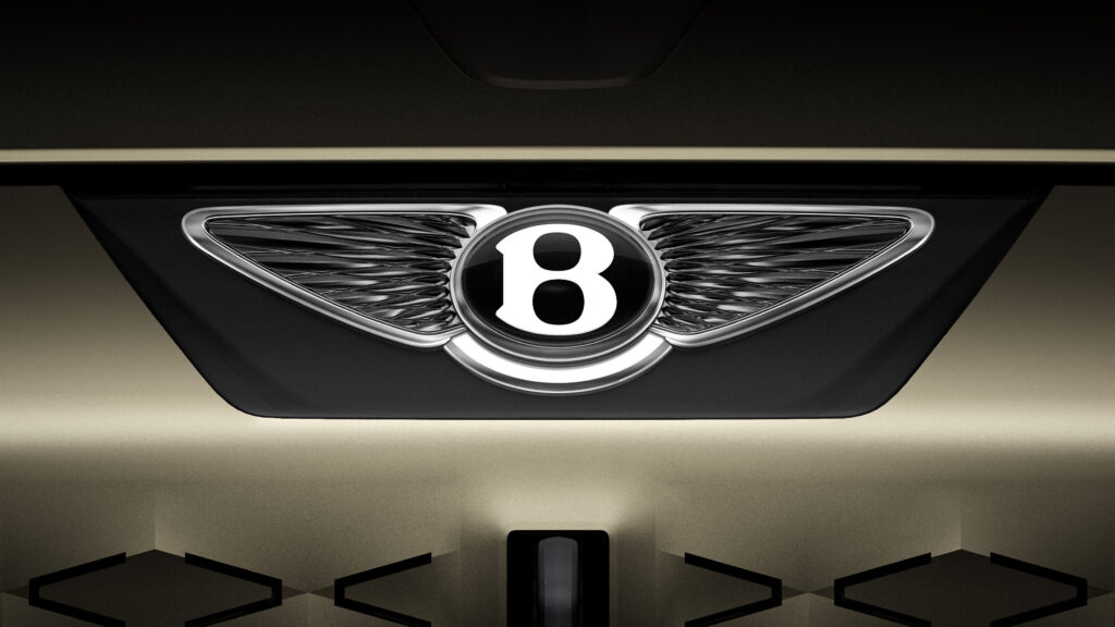
The British automaker Bentley has introduced an updated version of its iconic “Winged B” emblem. This is the fifth update to the logo in the brand’s 106-year history. The new version features stricter and sharper wing lines, as well as the possibility of using the letter “B” separately from the wings.
The updated emblem will first appear on a concept car, the presentation of which is scheduled for July 8th. This model will demonstrate Bentley’s new design language and is likely to be fully electric. On the same day, the company will open a new design center at its headquarters in Crewe, England.
History and Features of the New Logo
Work on the updated logo was carried out by Bentley’s internal team under the direction of Design Director Robin Page. The final version was proposed by interior designer Young Nam during an internal competition.
The original Bentley emblem was created back in 1919 by designer F. Gordon Crosby. Since then, the logo has been updated in 1931, 1990, 2002, and now in 2025.
The new logo will be the first step in a large-scale evolution of Bentley’s design and brand. The concept car presented on July 8th will not go into series production but will become a source of inspiration for future models. The company hints that the concept draws inspiration from one of the iconic models of the past but does not yet reveal which one.
The logo change occurs against the backdrop of the brand’s global transformation, as it prepares for a complete transition to electric vehicles by 2030. The new emblem, more modern but still recognizable, is meant to symbolize this transition while preserving the brand’s heritage. A feature of the updated design is the preservation of the three-dimensional effect through the use of light and shadow on the metal surface.