 by
by Update of the famous emblem
BMW has introduced an updated version of its famous propeller emblem. The new, more modern logo has lost one of the chrome rings, making it simpler and more in line with modern design trends. The updated badge can be seen for the first time on the new electric iX3 model, which debuted at the auto show in Munich.
Significant but subtle changes
The electric iX3 at the Munich Motor Show introduced us to BMW’s Neue Klasse design language. Although the main attention is drawn to the grille and headlights, which are reminiscent of models from the 1960s to 1980s, there is another less noticeable detail that will also appear on the brand’s future cars.
This refers to the famous propeller emblem that adorns the front and rear of every BMW, as well as being placed on the center wheel caps and steering wheel. Munich’s designers did not start from scratch but gave the iconic badge a slight facelift that makes it more modern and better suited to the modern lines of the electric iX3 crossover.
What exactly has changed?
There aren’t too many changes. The emblem still contains the blue and white propeller, which references the manufacturer’s aviation past, surrounded by a black rim with the company’s initials.
However, if you look closely at the comparison of old and new BMW logos, you can see that the 2026 version has less chrome. Both have an outer chrome ring, but the new logo has lost the inner chrome ring that separated the black rim from the blue and white propeller in the previous version.
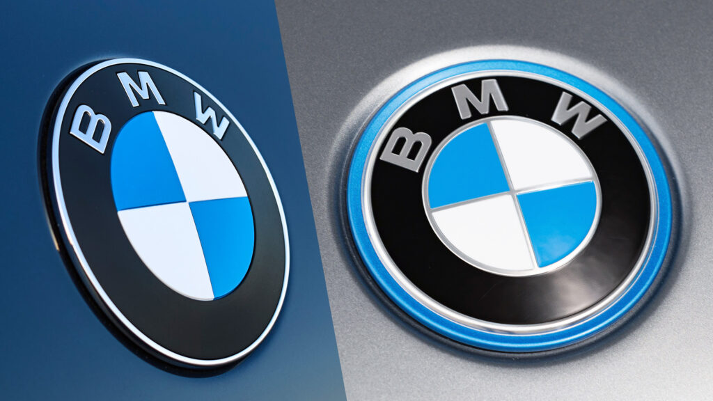
Update details
The horizontal and vertical chrome strips that separated the blue and white sectors have also disappeared. The remaining chrome now has a smoky appearance, adding a modern touch. For the iX3, BMW also abandoned the blue outer rim used on other electric models like the iX1.
In addition, the “BMW” letters have become thinner, the black section now has a matte rather than glossy finish, and the emblem itself has become flatter. The result looks very successful, especially against the backdrop of similar logo updates from VW and Porsche.
Update history
BMW already updated its logo five years ago to give it a more modern look, but back then the new version was only used in marketing activities, while the physical badge with lots of chrome remained on production models.
Reaction and future
It’s interesting to know what brand fans think: do they prefer the old emblem, or do they think BMW has done enough to update it, or perhaps they believe the Neue Klasse design revolution deserved a more radical reinterpretation of the logo?
Photo: Stefan Baldauf & Guido ten Brink
The BMW logo update takes place in the context of a general trend towards simplifying corporate symbolism. Many automakers have recently been abandoning excessive details in their emblems, favoring cleaner and more minimalist forms. This allows for better adaptation of the brand to the digital environment and modern design trends. The changes in the BMW logo, although subtle at first glance, demonstrate the company’s attention to detail and its desire for continuous improvement even of such seemingly immutable elements as corporate symbolism.